Mourant
We delivered a sophisticated new corporate rebrand.
About the project
Mourant is a leading offshore law firm delivering a complementary range of fiduciary, administration and governance services, working with the most prestigious international legal and accountancy firms. Mourant’s clients include the world’s leading corporations, financial institutions, investment funds and public organisations. The mission of the firm is to build a trusted relationship with every client to deliver a consistent and seamless experience.
Gaia Fontana in partnership with Principia Consultants was honoured to have the opportunity to work alongside the marketing team of the awarded offshore law firm Mourant. Together we delivered a sophisticated new corporate rebrand.
A CRAFTED EMBLEM
Our journey leads to exploring the world of an offshore law firm operating worldwide with connections all over the globe.
Our journey leads to exploring the world of an offshore law firm operating worldwide with connections all over the globe.
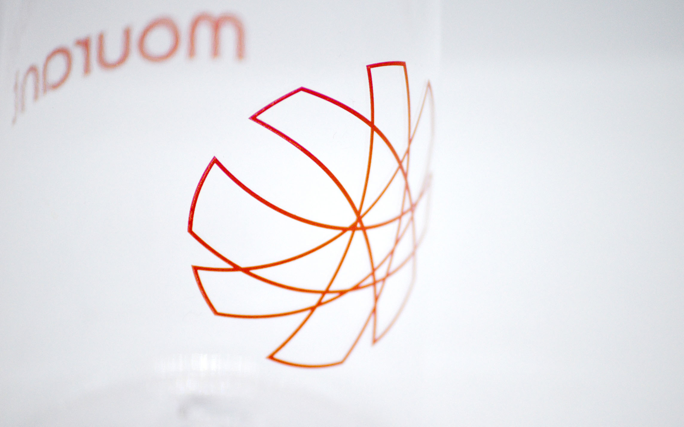
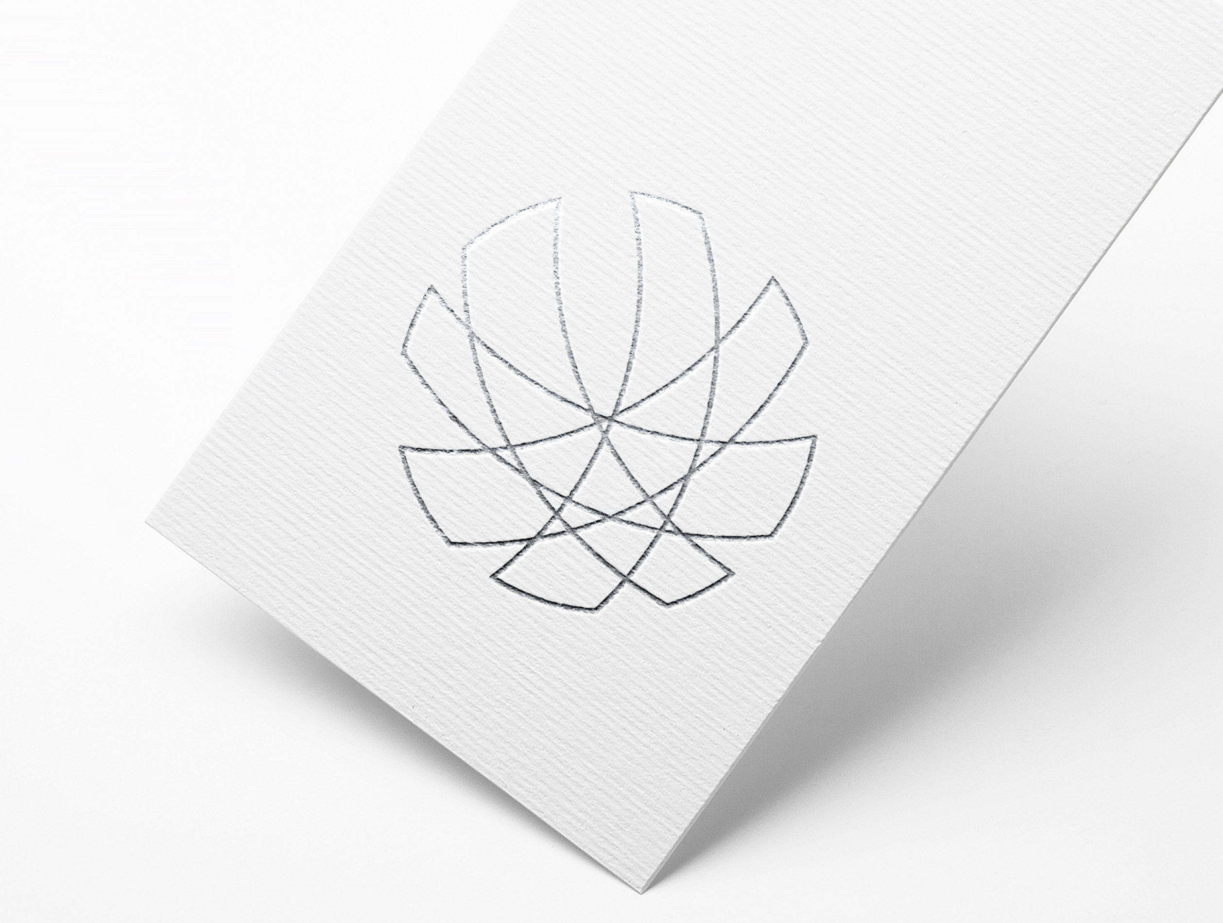
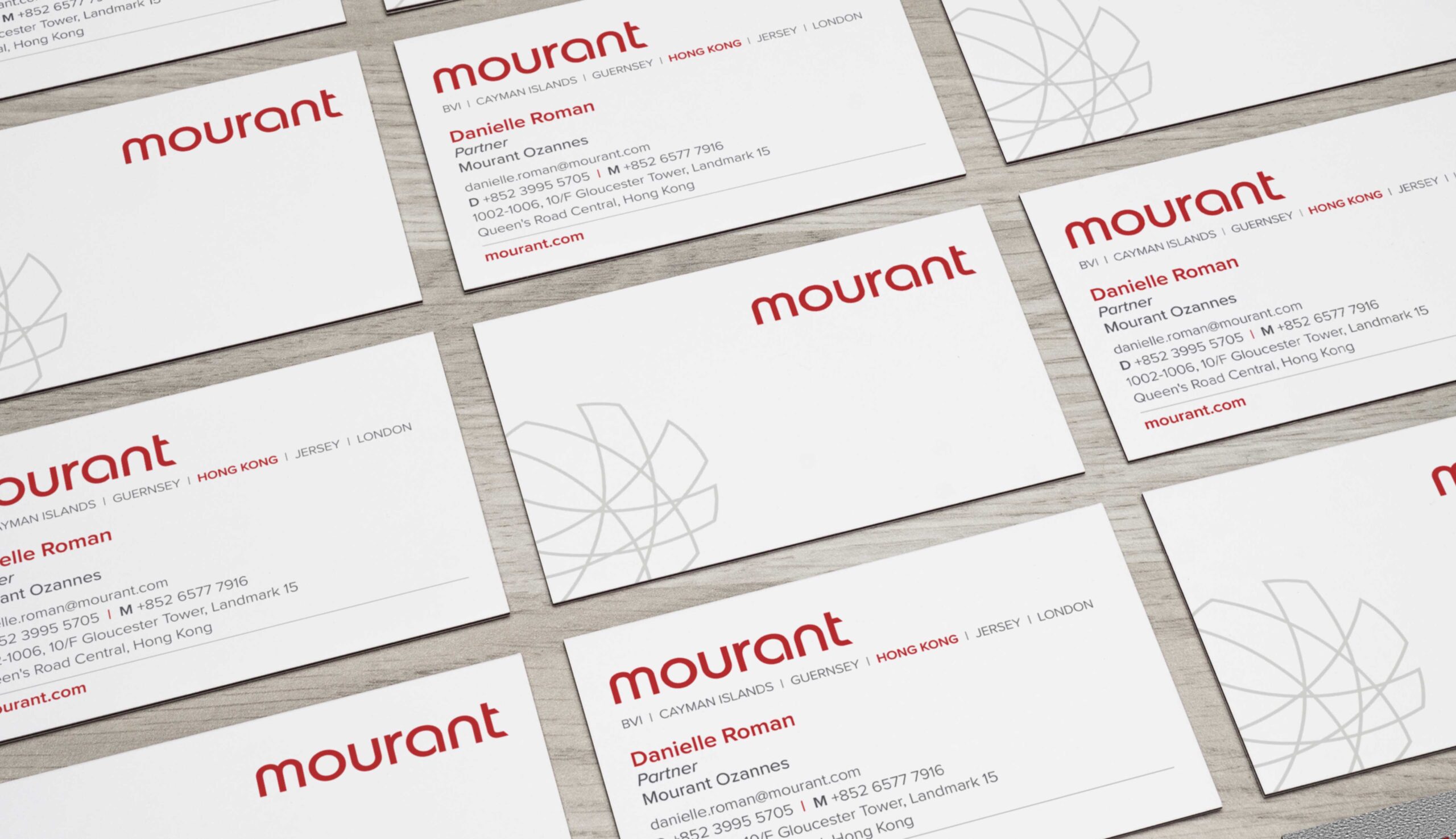
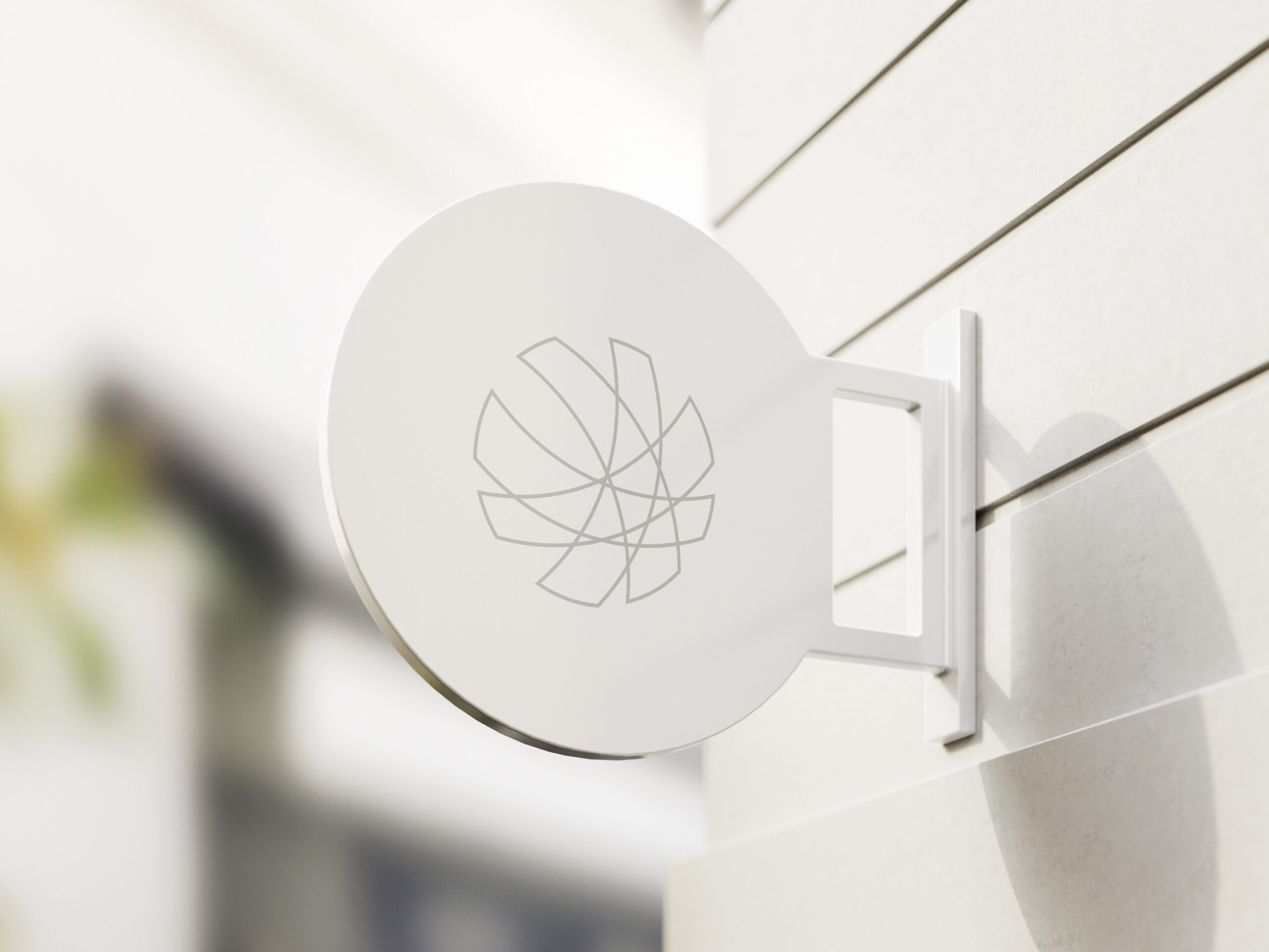
The idea of a window on the entire globe leads us to the creation of an emblem formed by lines and intersections to recreate international connections all over the world.
The lines of an international network cross each other to create a new globe, a new perspective window on the world. The crafted emblem was inspired by the network connection of an international globe. This analogy reinforced the concept and the narrative that characterise the vision of Mourant.
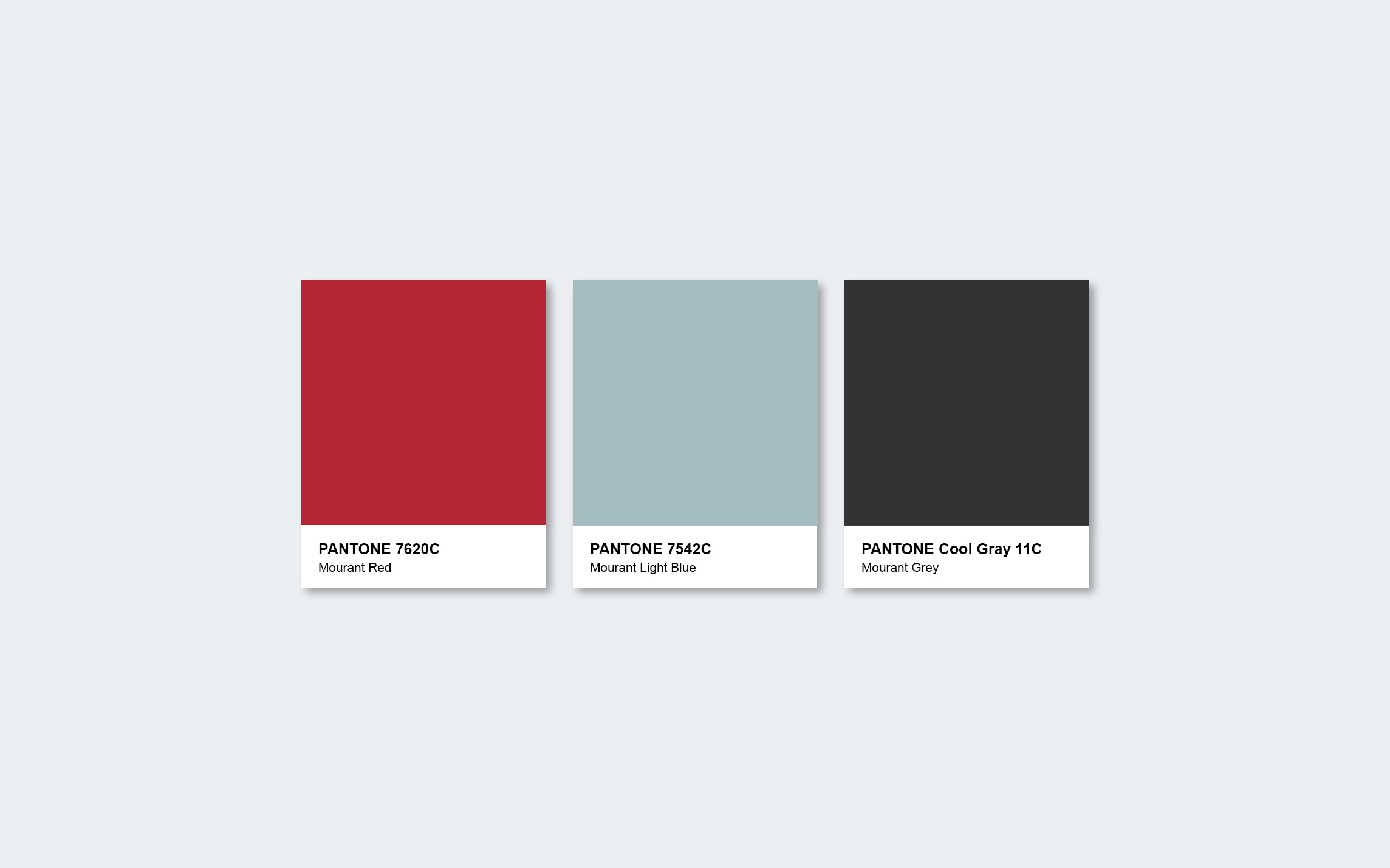
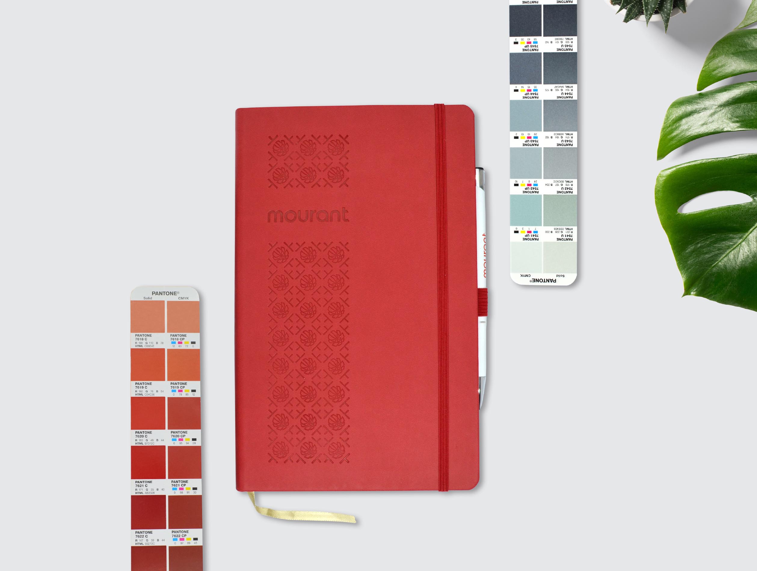
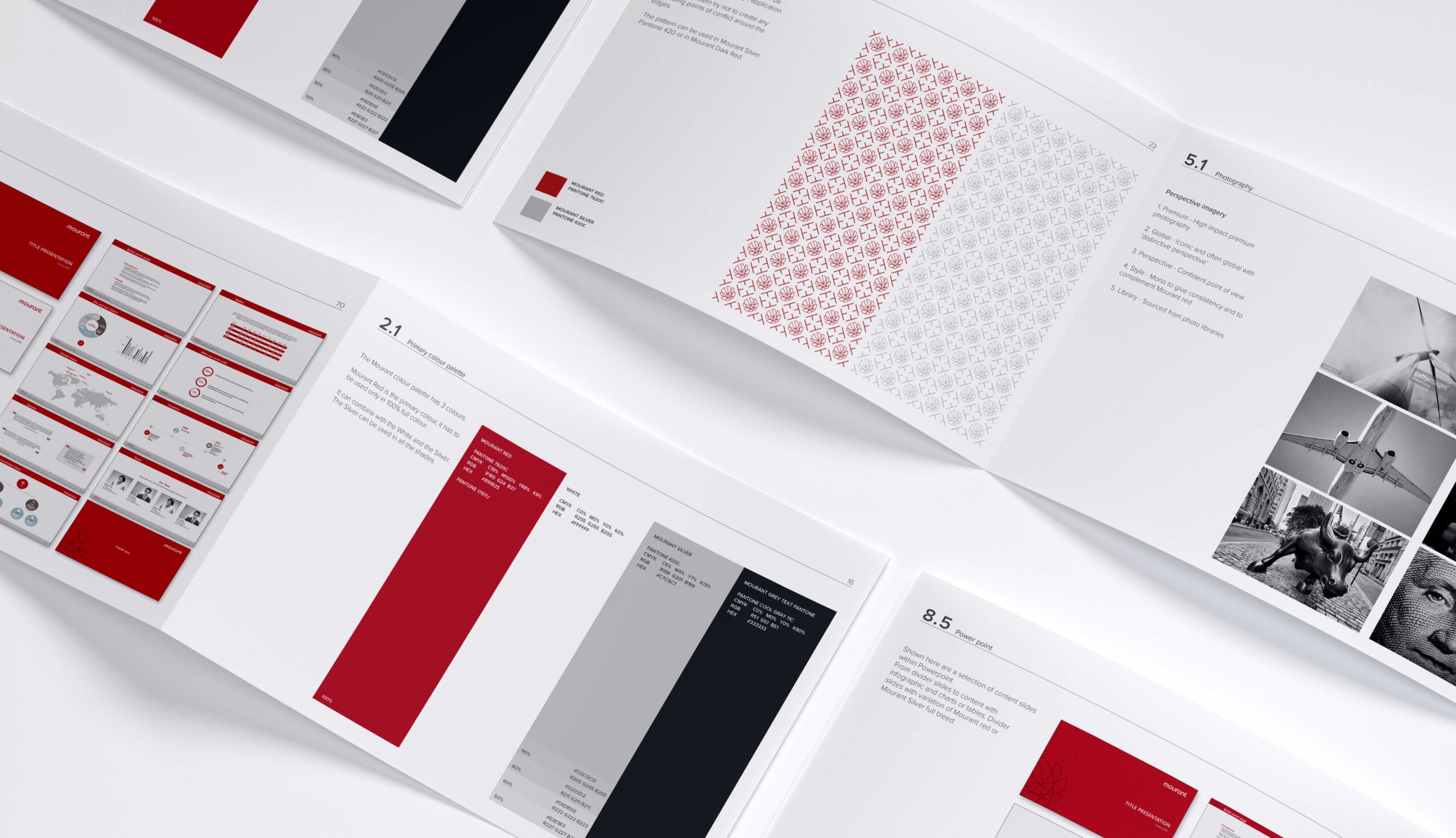
A new brilliant and sophisticated colour palette is used for the new visual identity. The establishment of a solid colour palette is fundamental to stating the strength and consistency of the brand. Mourant red is the primary and distinctive colour that makes the brand immediately recognisable throughout different applications, from corporate material to merchandising and social media.
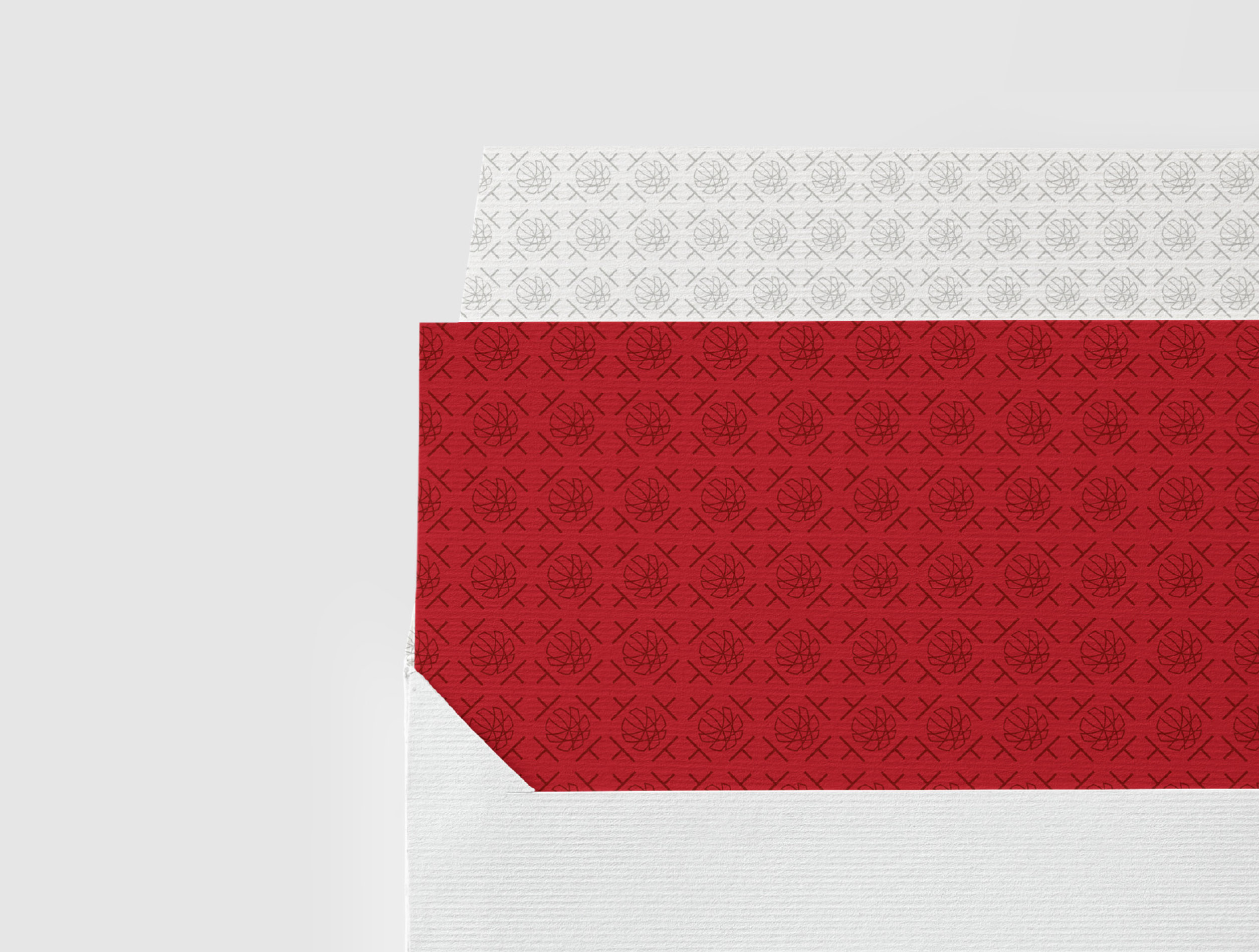
The intersection of the emblem with the simplified letter “t” taken from the newly crafted brandmark delivered the creation of a unique pattern aimed to enrich all the marketing materials and the stand-up in the merchandising items.
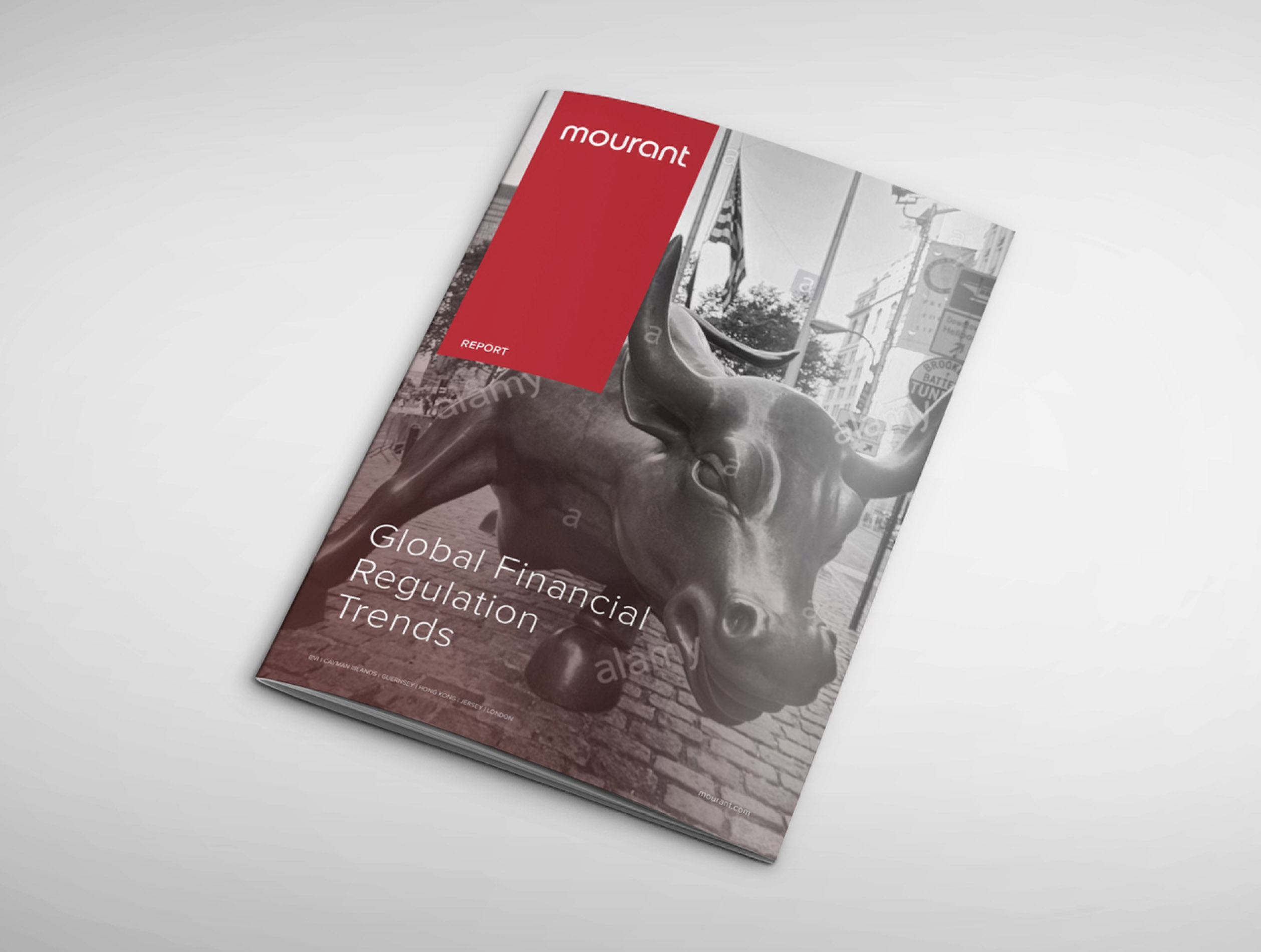
The new vision of the brand is required to define a new direction of photography. The firm aimed to set a high-impact style, iconic and capable to communicate a sense of globality, highlighting the freshness and the modernization of the brand. Research led us to choose a unique point of view aligned with the perspective embraced by the company: black-and-white photography with the subsequent application of a filter. This new photographic style is applied to the whole visual identity of the brand.
As part of the whole brand restyling, the photographic guidelines we provided helped to make a photoshoot aimed to capture the soul of the team and the approachability of the people working in Mourant.
As part of the whole brand restyling, the photographic guidelines we provided helped to make a photoshoot aimed to capture the soul of the team and the approachability of the people working in Mourant.
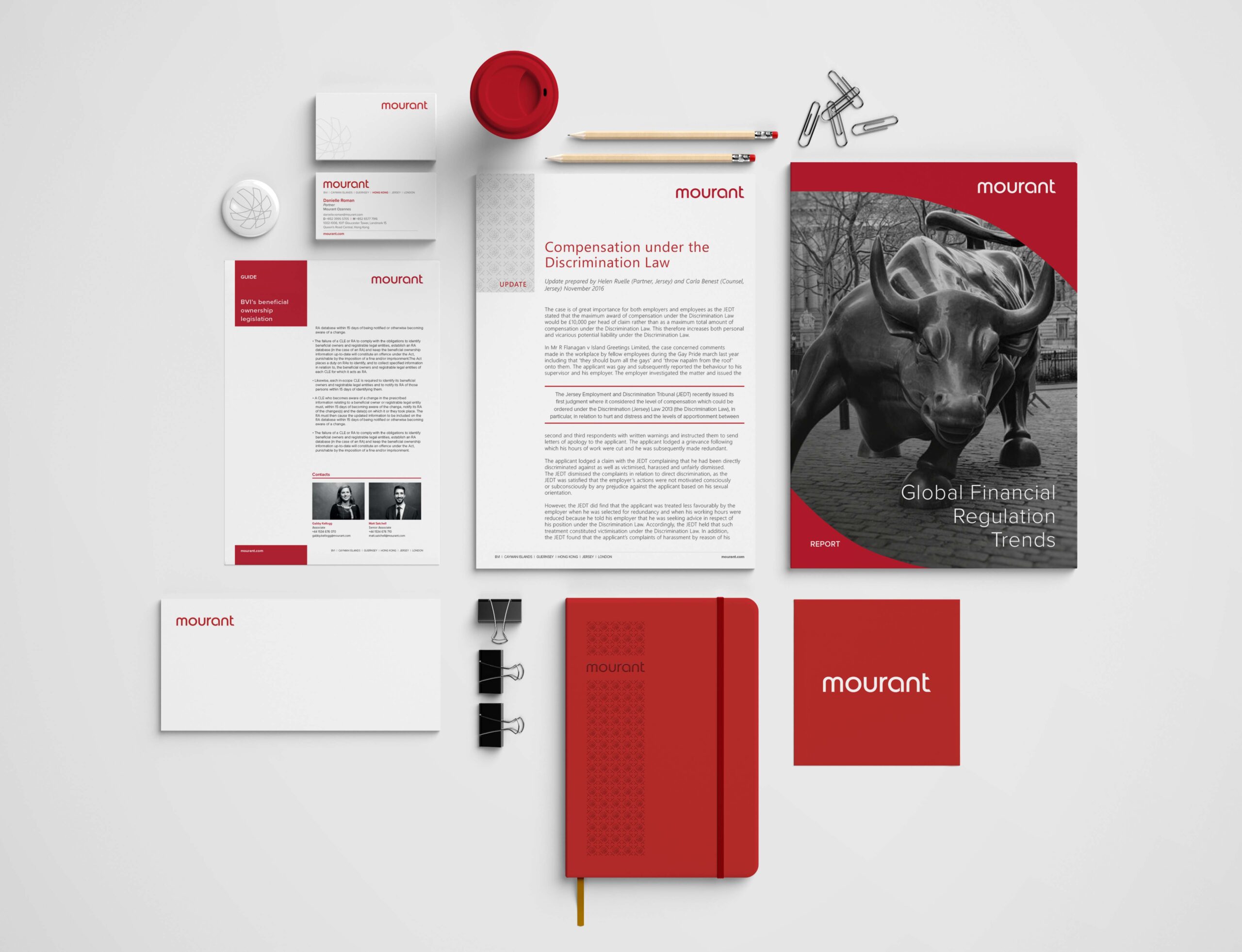
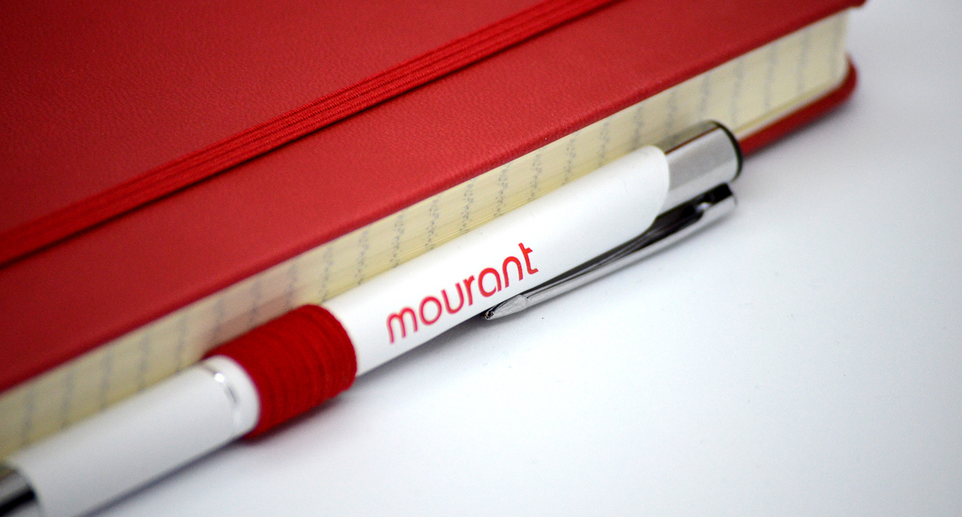
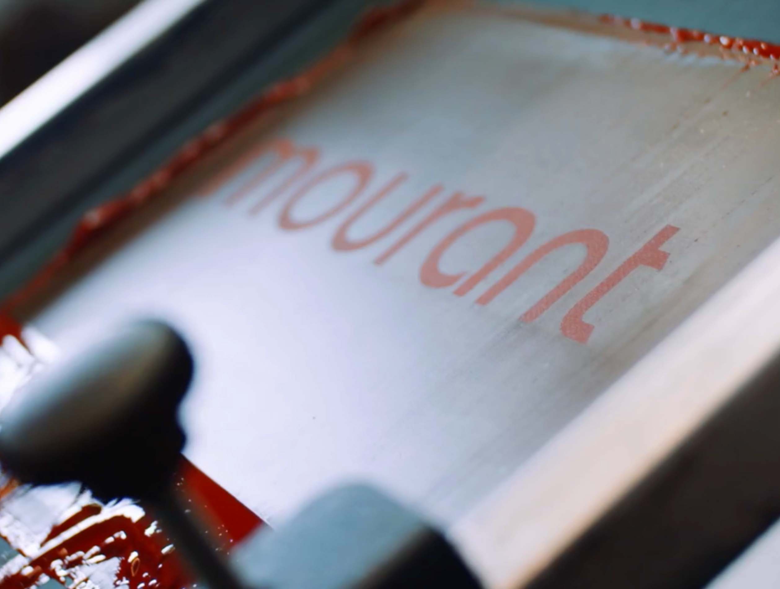
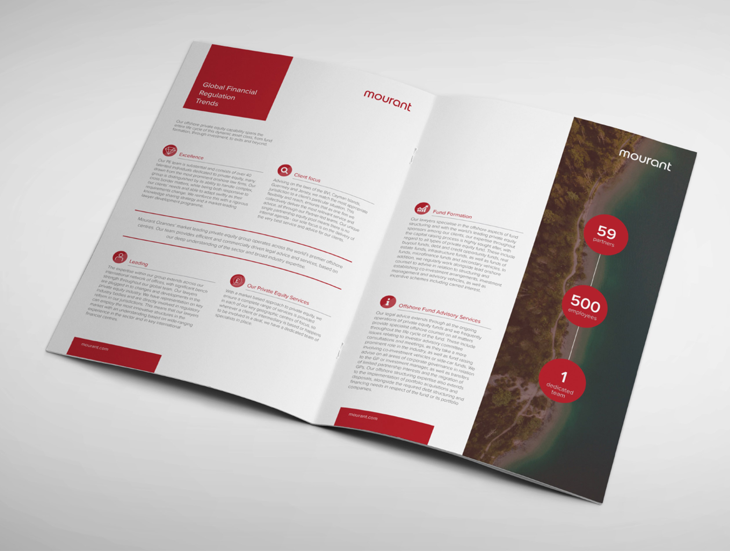
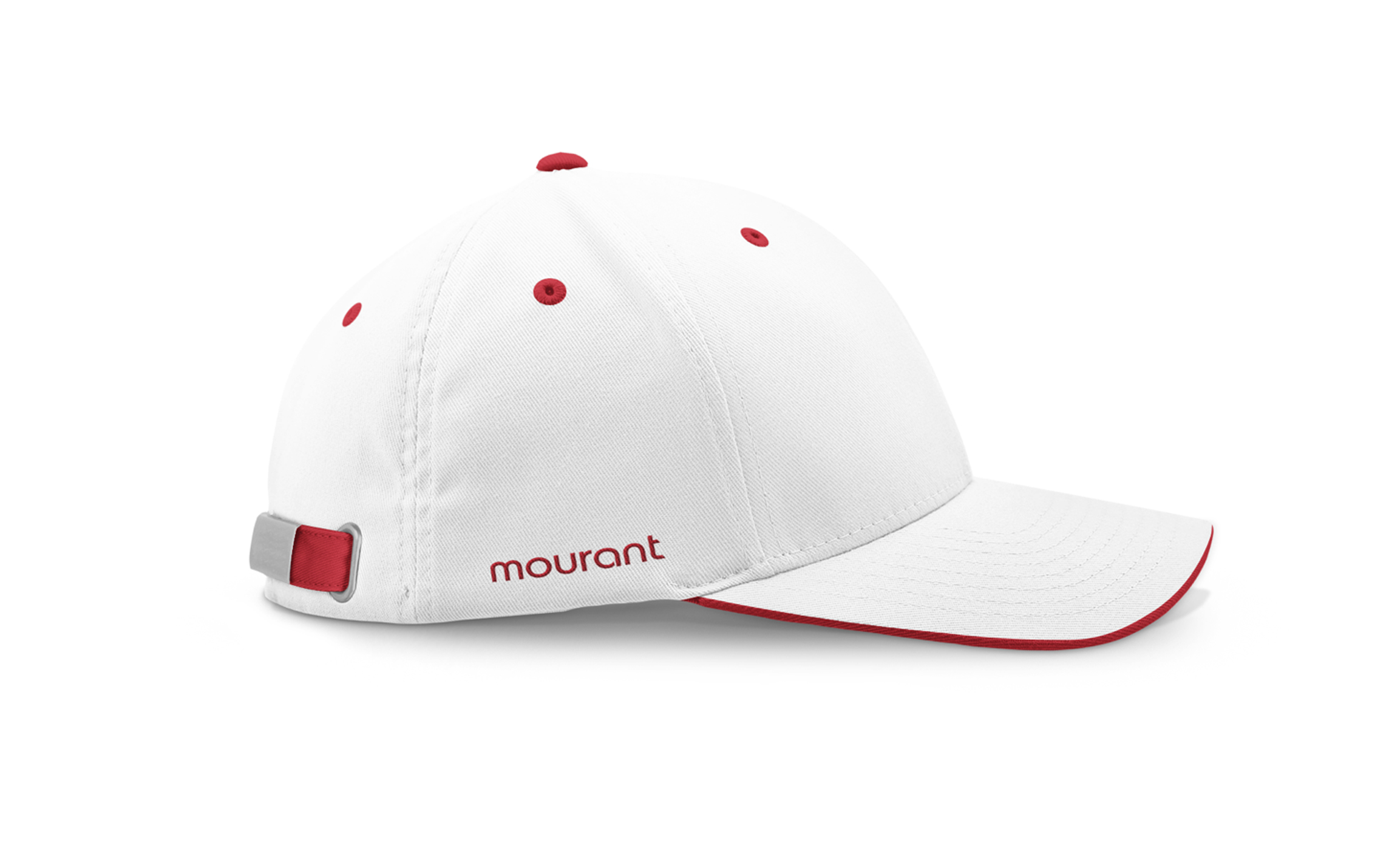
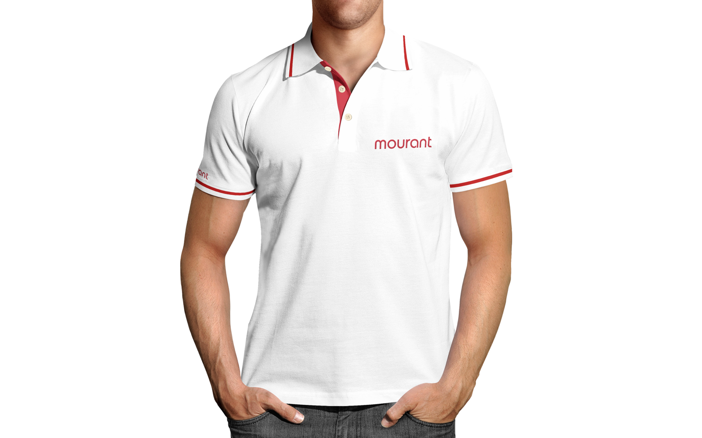
To support the improvement of promotional material with the new brand identity, we created the design to integrate the new brand logo on different supports. Merchandising includes, amongst others, bottles, umbrellas, stationery and roll-ups.
This material is aimed to be used not only to spread the knowledge of the brand among clients but also internally to nurture the spirit of collectiveness among the people working in Mourant.
This material is aimed to be used not only to spread the knowledge of the brand among clients but also internally to nurture the spirit of collectiveness among the people working in Mourant.
TEAM
Creative Director Gaia Fontana
Agency Principia Consultants
AREA OF WORKS
Logo Design
Brand identity
Corporate Stationery Design
Promotional Merchandise Design
Photography
Infographic and Iconographic Design
PPT Concept Design
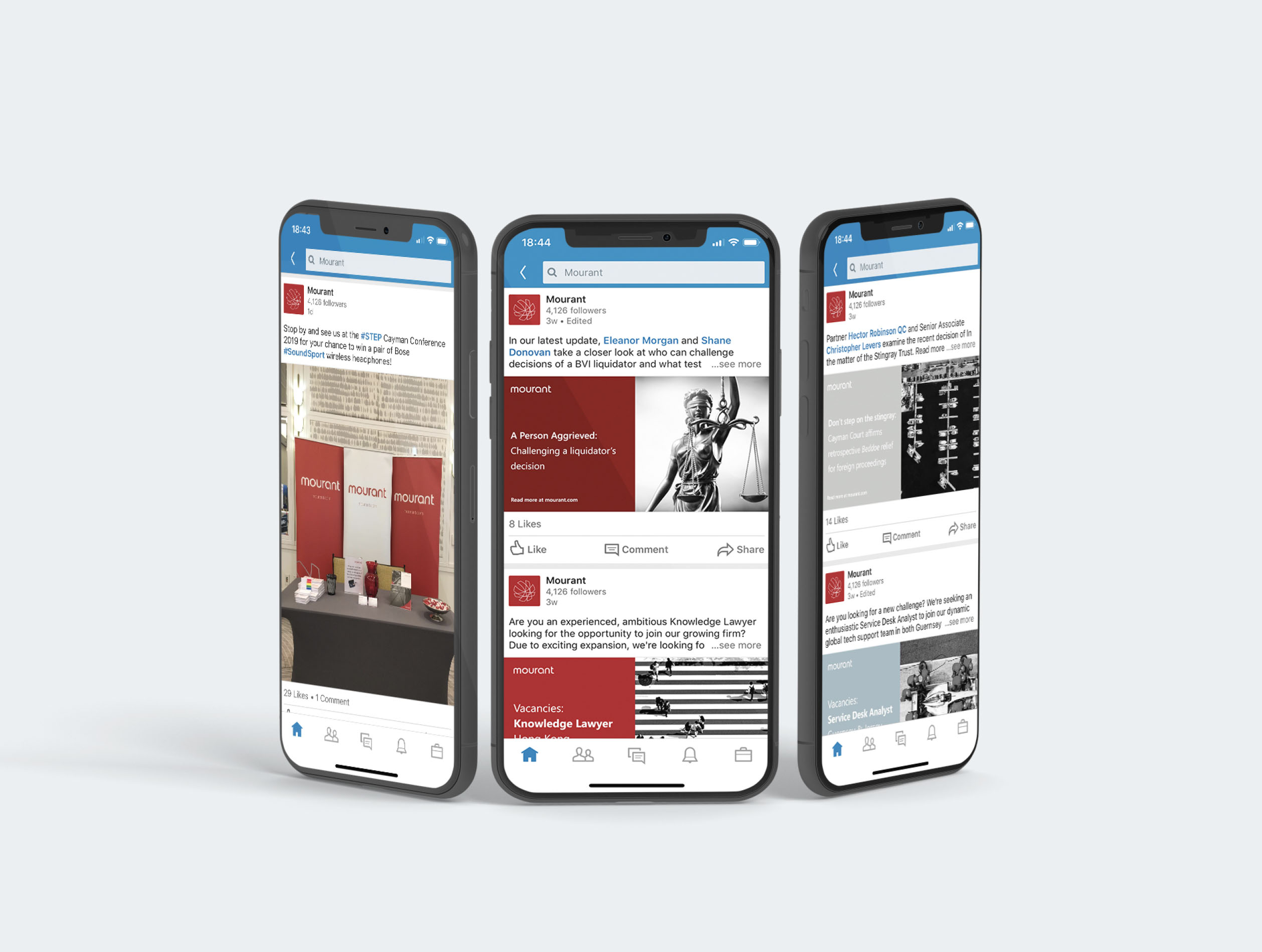
Social Media Design
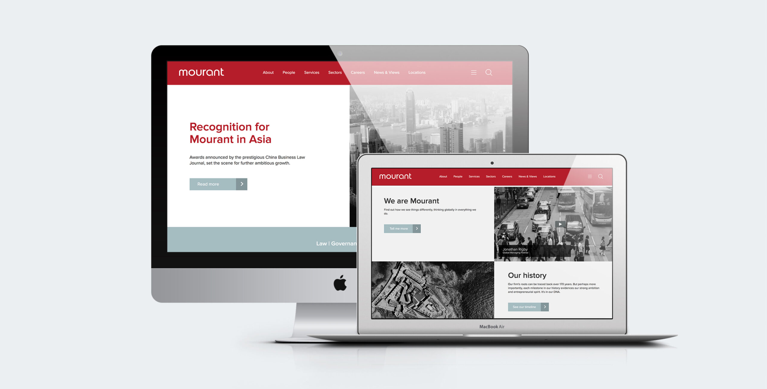
Website Design Concept
Brand Guidelines
Creative Consultancy
APPRECIATIONS
2019 Silver - BMRAWARDS
GAIA FONTANA STUDIO
BRAND AND DIGITAL DESIGNER
LONDON