
Grapedata
IT start-up data sourcing platform branding.
About the project
Launched in 2016, Grapedata started with a vision to fill the gap of information between the financial world and people across the world.
Financial markets take time to collect and analyze information from specific sectors and from remote locations. The company realized that people all over the world hold a missing piece of the puzzle, such as qualitative insights or in-depth opinions regarding trends, products, and services.
The platform created by Grapedata aggregates all this kind of information, allowing it to share with other people at the right time, to make it useful for informed investment decision-making. I was tasked with supporting this launch by creating a new brand identity and website that would explain their challenge in the financial market. Furthermore, we were tasked with helping the company to deliver two different messages to the different users of the Grapedata platform.
Technology data design
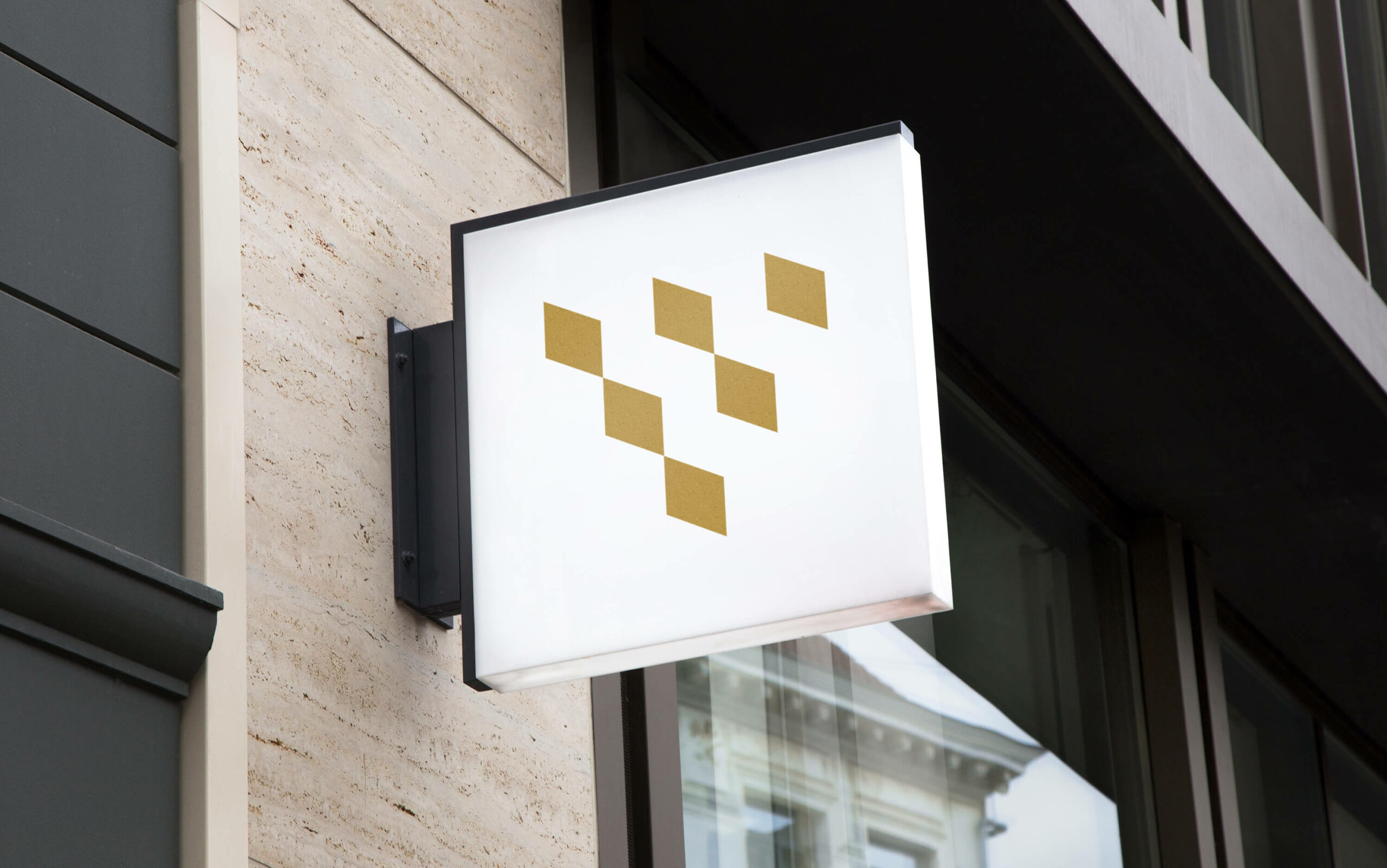
The new emblem is intentionally designed as a pun on the name of the company, connecting the practice of collecting data with the analogy of the collecting grape. As it recalls the wine-making area, the design is shaped with blocks of data connecting to each other, creating the data collection the market is looking for.
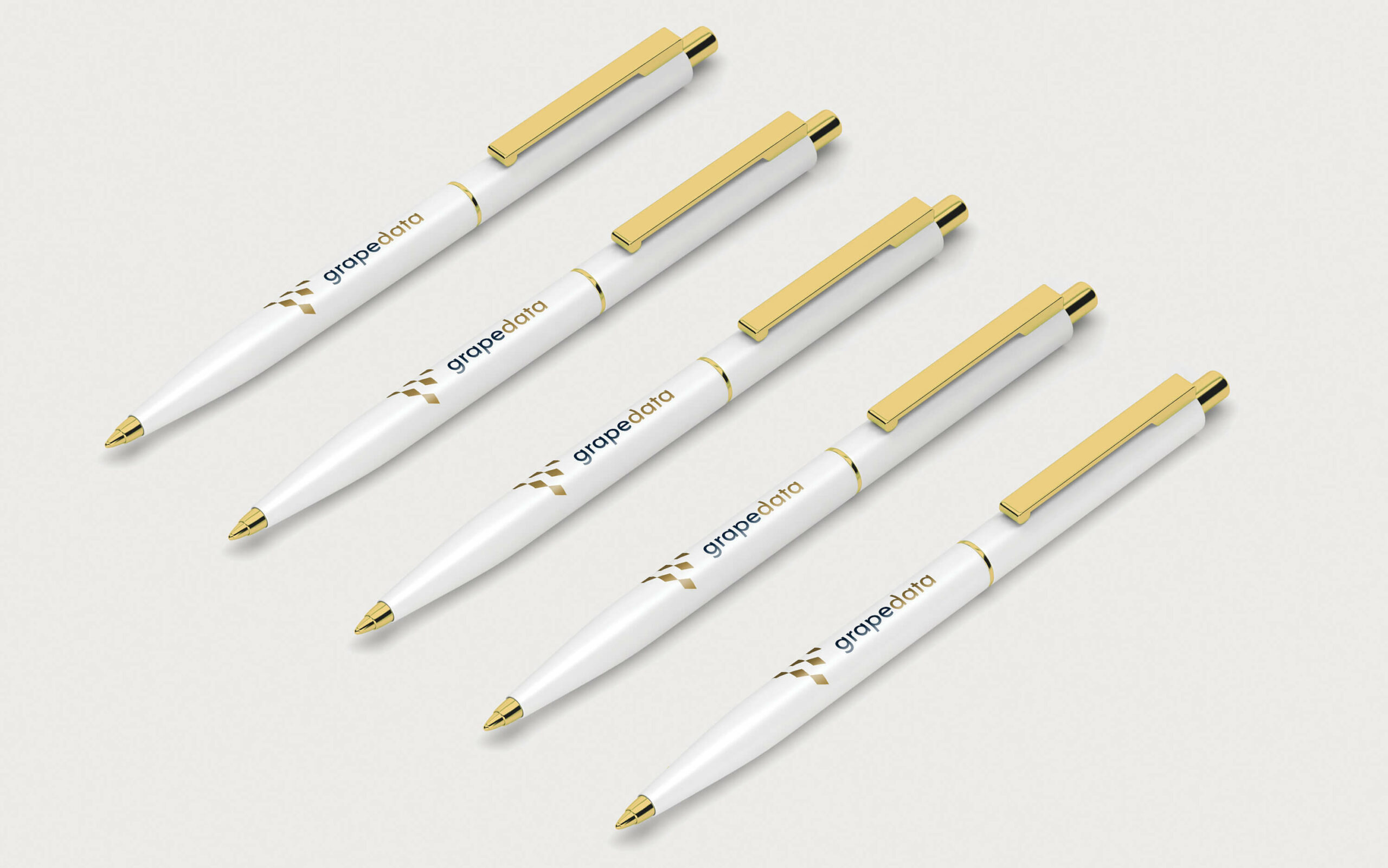
With its two different colours, the wordmark highlights the connection between the word “data” and the emblem. A royal & stylish colour palette is used throughout the brand identity to keep the consistency and establish the strength of the brand.
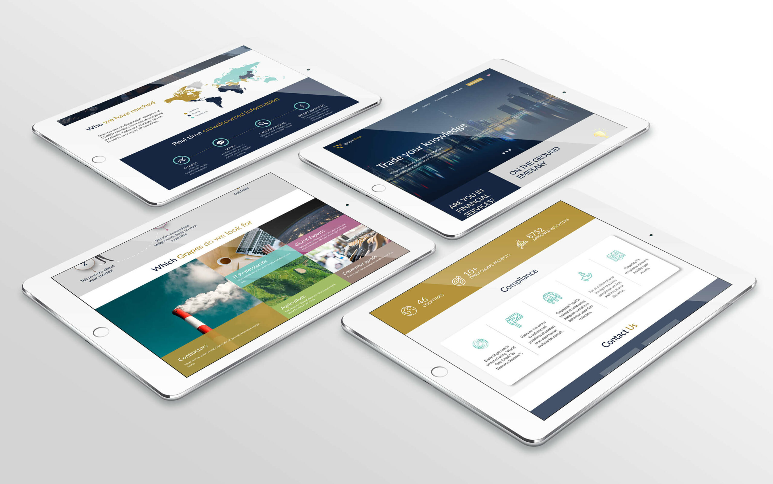
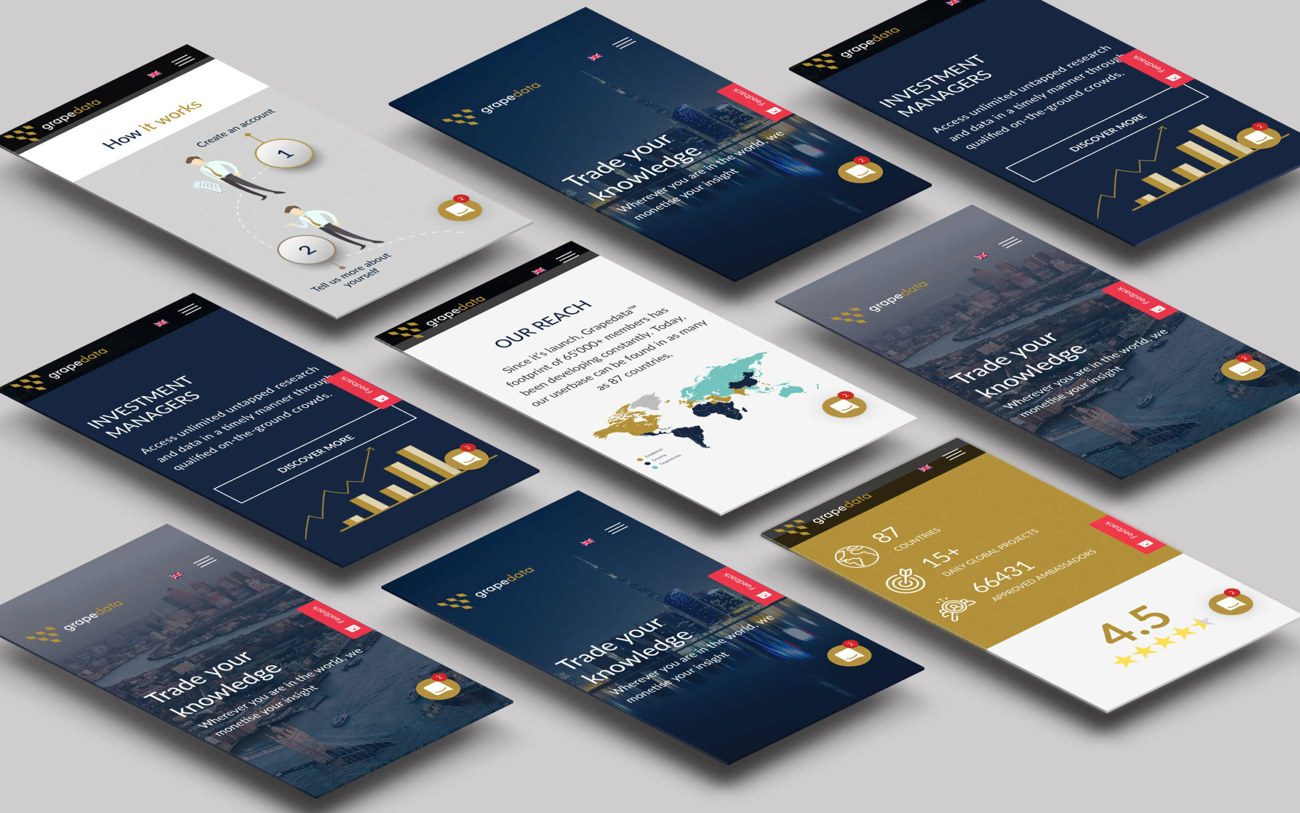
Responsive website
The new fully responsive Grapedata website needed to communicate a complex but important process. The company addresses two different types of users: clients in the financial area buying data and single users who provide the necessary data for specific sectors. Pointing at these audiences, the company was required to communicate two different messages.
Therefore, the design & UX had to be carefully considered to ensure that the user journey for these two different users was conveyed in a clear and structured way. Infographics and iconographic designs are specifically created to support the message.
TEAM
Creative Director Gaia Fontana
AREA OF WORKS
Logo Design
Brand identity
Website Design
Project Management
Infographics and Iconographic
Art Direction Photography
GAIA FONTANA STUDIO
BRAND AND DIGITAL DESIGNER
LONDON